Hej everyone,
colors have the power to influence moods, define spaces, and reinterpret designs. The color trends for 2025 feature an exciting mix of natural earth tones, soft pastels, and futuristic colors like digital lavender.
But how do you combine these modern tones with timeless vintage design?
Whether Mid-Century Modern, Modernist, or 70s Retro – in this guide, you'll learn how to integrate the trend colors of 2025 into your interior and perfectly showcase them with iconic vintage pieces!
1.The color trends 2025:
These are the hottest shades. Every year, color experts and trend researchers set new trends in the interior design world.
In 2025, the focus will be on harmony, closeness to nature and a touch of futurism.
🎨 The most important trend colors 2025 :
✅ Earthy natural tones : Warm brown and beige tones, terracotta, olive green and sand colors bring natural calm into the living space.
✅ Digital Lavender : A soft, futuristic shade of purple that radiates calm and can be used in a modern way.
✅ Pastel shades : Delicate pink, pistachio green and light blue create a soft, friendly atmosphere.
✅ Midnight Blue & Fir Green : Dark, elegant colors that add depth and elegance to the room.
✅ Butter Yellow & Honey : Warm, sunny colors that perfectly match the retro style.
These colors combine wonderfully with vintage design – but how exactly?
2. Earthy natural tones & Mid-Century Modern – a perfect symbiosis
Why natural tones?
Warm brown tones, soft beige, or terracotta represent a connection to nature and coziness. These same values are reflected in Mid-Century Modern, the timeless vintage style of the 1950s and 1960s.
How to combine natural tones with mid-century design:
✔ Wooden furniture and accessories in walnut or teak go perfectly with warm wall colors in sand or ochre.

✔ Leather & bouclé fabrics in beige or cognac bring coziness to the design.
✔ Ceramic & terracotta complement the natural look – perfect for decorative elements or lamps.

✔ A touch of gold in the form of brass lamps or handles sets elegant accents.
💡 Tip : A warm terracotta wall with a teak sideboard and a cream-colored bouclé armchair creates a stylish, timeless mid-century corner.
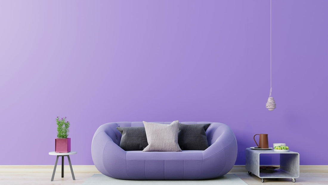
3. Digital Lavender – the modern twist for vintage design
Why Digital Lavender?
This soft shade of purple represents calm, creativity, and a futuristic lightness. It's a modern color—but can it harmonize with vintage?
How to combine Digital Lavender with retro design :
✔ With dark wood : Teak or rosewood create a beautiful contrast to the cool lavender tones.

✔ In combination with brass : Golden elements bring warmth to the look and ensure elegance.
✔ With Art Deco elements : The delicate purple tone goes perfectly with geometric patterns and luxurious materials.
✔ With retro velvet armchairs : A lavender velvet armchair as a highlight in a vintage interior – a real eye-catcher!
💡 Tip : If you don't dare to use Digital Lavender as a wall color, opt for accessories such as cushions, vases or rugs.
4. Pastel colors & 50s modernist – lightness meets vintage
Why pastel colors?
Delicate shades of rose, mint or sky blue are reminiscent of the cheerful designs of the 1950s and bring lightness to the room.
How to combine pastel with vintage elements :
✔ Soft pink + gold : A mid-century dresser with gold accents and pastel details looks modern and nostalgic at the same time.
✔ Light blue + walnut : A retro sofa in light blue harmonizes wonderfully with dark wood.

✔ Pistachio green + white : A fresh yet cozy combination, perfect for the Scandinavian style.
💡 Tip : Use pastel colors purposefully – as wall paint, on chairs or in the form of retro ceramics.
5. Midnight blue & fir green – elegance in retro style
Why dark colors?
Midnight blue and fir green add depth to the room and lend vintage furniture a luxurious touch.
How to combine dark colors with retro design :
✔ With gold & brass : Dark colors look particularly elegant with gold accents.
✔ With velvet : A deep blue velvet armchair is the perfect complement to mid-century wooden furniture.
✔ With dark wood : Rosewood or ebony go perfectly with these intense colors.

💡 Tip : A dark green wall with retro artwork in wooden frames creates a noble, timeless atmosphere.
6. Butter Yellow & Honey – the perfect complement for retro design
Why yellow tones?
Warm, sunny yellow tones bring joie de vivre and are reminiscent of the optimism of the 70s.
How to combine yellow with vintage elements :
✔ With warm brown : Mustard yellow sofa cushions on a brown leather sofa bring retro vibes.
✔ With geometric patterns : Combine yellow details with 70s wallpaper for a cool look.

✔ With glass & chrome : Yellow glass vases or lamps in space-age design go perfectly with it.
💡 Tip : Yellow looks particularly modern when combined with neutral colors such as beige or cream.
Conclusion: How to bring the trend colors of 2025 into your vintage interior
The color trends for 2025 can be perfectly combined with vintage design – be it mid-century modern, modernist or retro style.
👉 Natural tones & mid-century – wooden furniture and warm brown and beige tones for timeless elegance.
👉 Digital Lavender & Retro Design – A modern touch for classic vintage pieces.
👉 Pastel tones & 50s modernist – Playful, light accents for a fresh look.
👉 Dark colors & retro luxury – midnight blue or fir green for depth and elegance.
👉 Butter yellow & 70s retro – Sunny colors for a cheerful vintage style.
Which color trend appeals to you most? Share your opinion in the comments!